The London Clinic
A more complete kind of care
Identity | Communications

Today patients want to feel in control of their own health and are asking for more transparency from their healthcare providers. The London Clinic has always had a first class offer but the traditional structure only allowed the patients to see a series of fragmented parts. They needed to create a brand that moved away from speaking to consultants and instead focused on the patients themselves. This requires a new narrative to explain this fresh, connected approach.
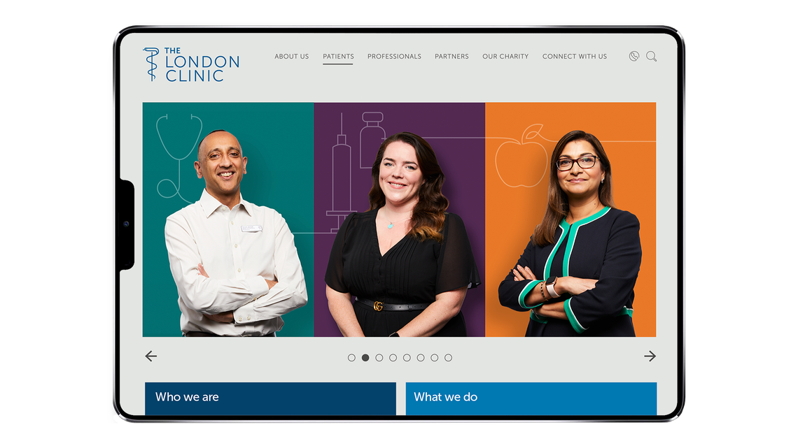
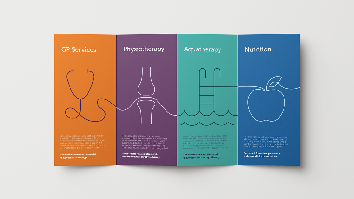
By focusing on the brand promise of 'a more complete kind of care', The London Clinic was able to take a truly holistic approach to healthcare to better treat their patients. This process of joining up all aspects of clinical care is reflected in our visual identity. The illustrations connect together seamlessly, clearly signposting the different stages of treatments.
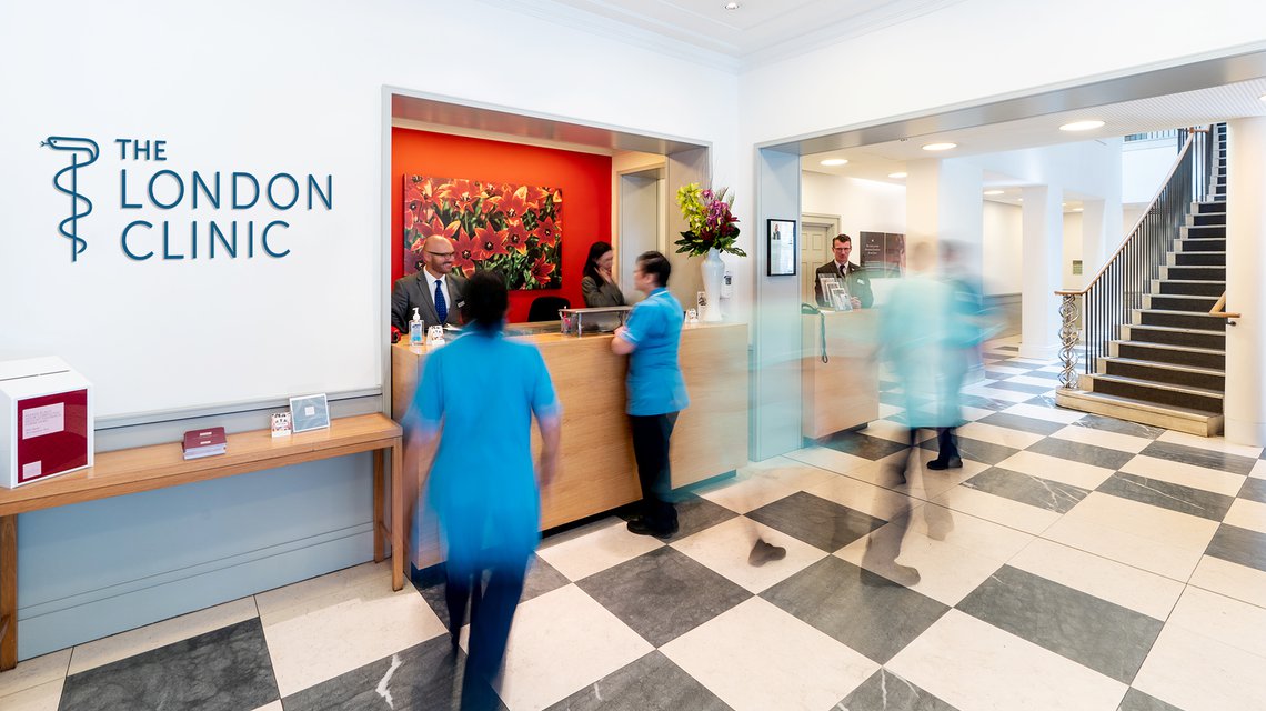
The visual connection in the photography symbolises the way in which patients are connected with clinicians, clinicians with colleagues and patients with their wellbeing. Working closely with The London Clinic, we created a vibrant and colourful brand centred around the patient’s experience. The colour combinations and illustrations give the identity its flexibility and character.
The Rod of Asclepius has been with The London Clinic for over 200 years. A historical symbol of healthcare, we have given it an update that perfectly merges the ancient and the new.